
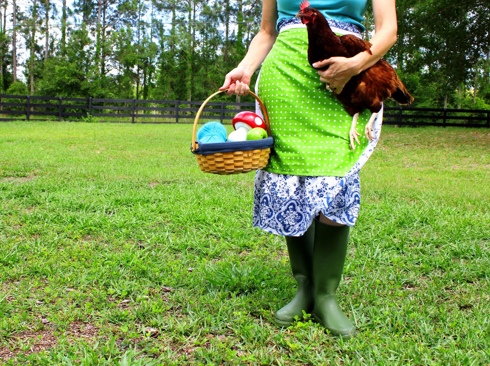
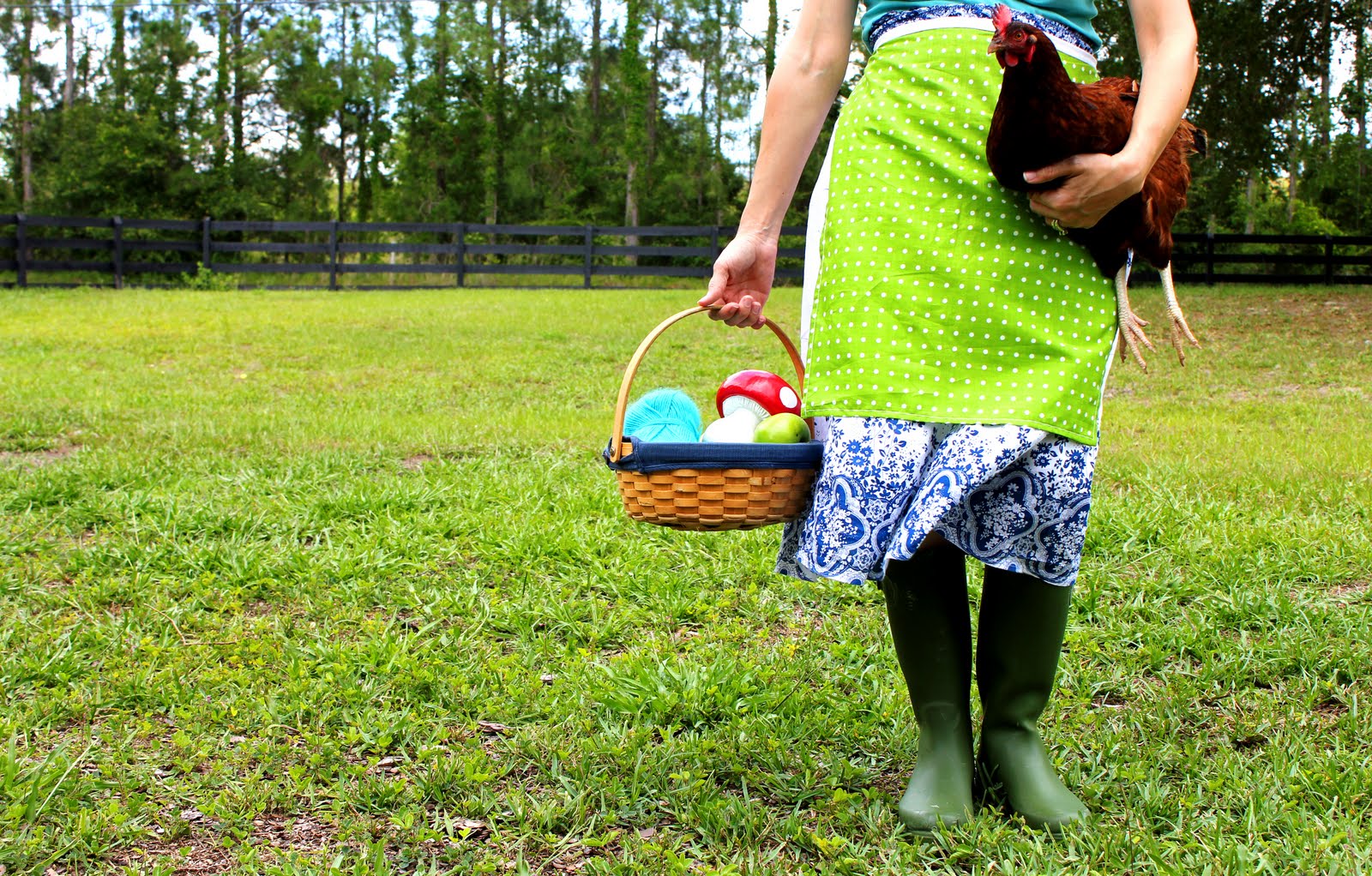
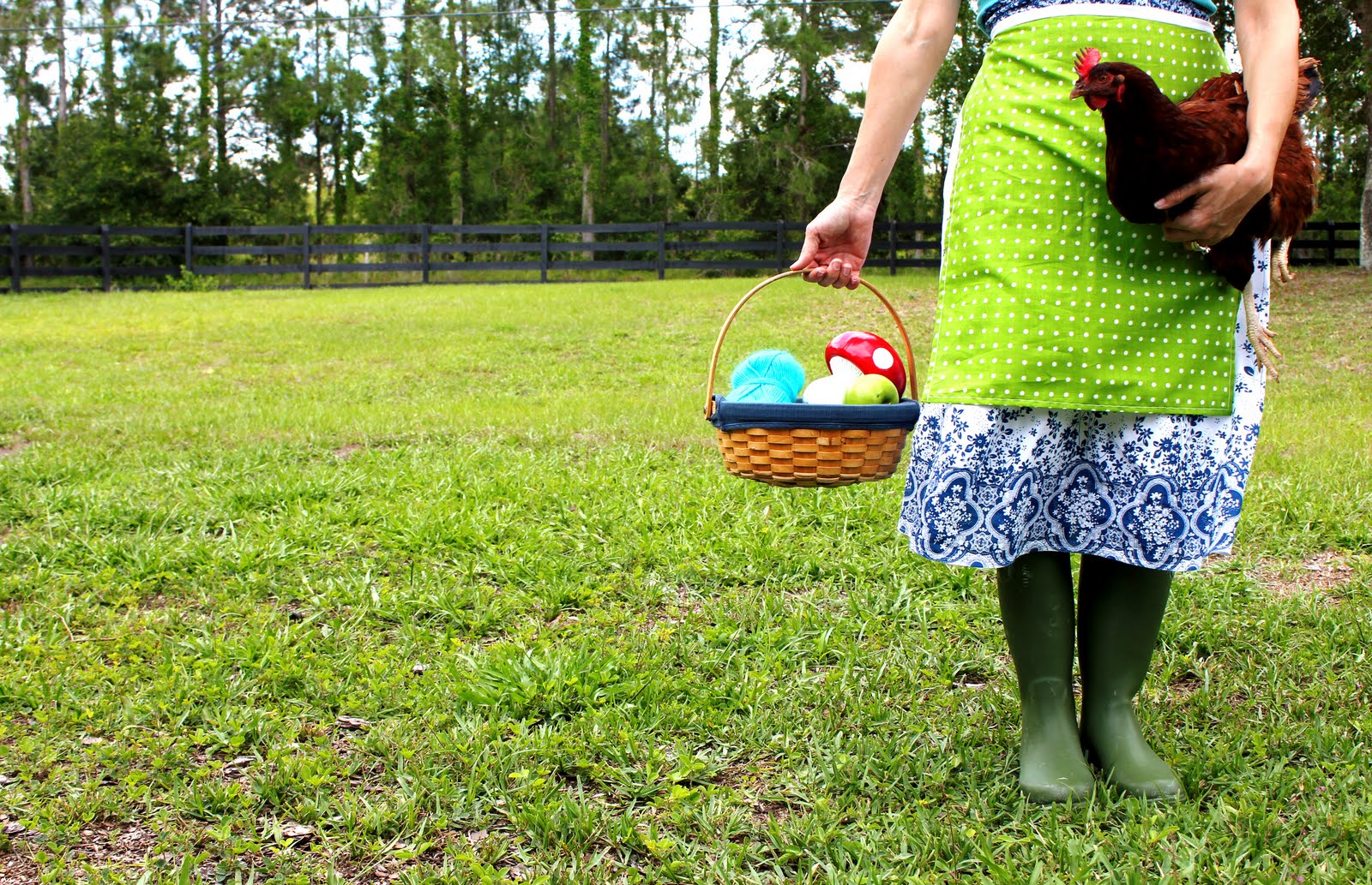
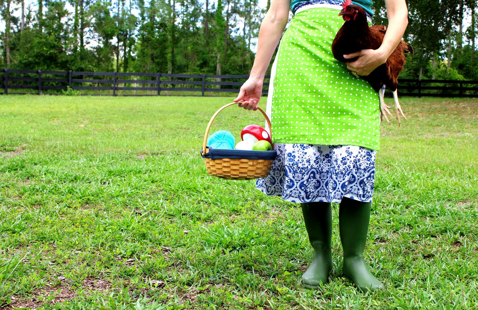
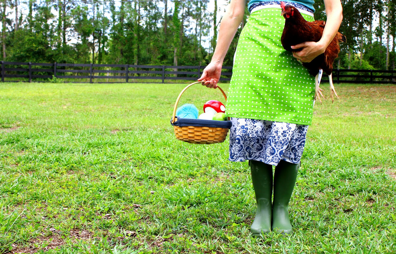
I have been planning a revamp of Crunchy Catholic Momma. I am working on a new banner and blog button so anyone who wants one can grab it and put it on their blog : ) I found a really great graphic designer who is waiting for me to send her my picture but I am stuck. There are 5 pictures I need to choose from for the banner and there are 3 pictures for the button.
Please help me to choose your favorite by leaving a comment. I will be giving away an apron just like the one in the picture to the winner. You get one entry per comment telling me which are your favorites and why and remember if you are not a follower you can’t be a winner. You can also get another entry by posting this giveaway to your own blog or facebook.
Here are the pictures for the banner, the best picture will be turned into my new banner. They may all look the same but they are all different and I can’t choose so please help!
This Crunchy Catholic Momma’s giveaway can be entered by any ONE of three ways. You get an entry for every one that you do.
1) By linking about this giveaway (to your blog, facebook, or any other site), you have to let me know you did and where you did.
2) By leaving a comment on your favorite pictures and why
3) By becoming a follower of my blog. There is a FOLLOW button at the upper right hand bar on this blog. If you win and are not a follower, the prize will go to the next person : ( sorry!


#2 and #6.
Congrats to Grammy Suzzy!!! Email me with your information please. You can find my email at the top of the blog page. Thanks to everyone who commented, I picked the pictures that were picked the most…all along those were the ones I liked too : )
I like 5 and 6. I agree with the other posters about it just seems more natural. Very cute!
Hello I became a follower; but I will post this on Facebook too. For the banner; definitely #2. The skirt has the best composition on that one. Chicken and basket look good too. For the button; #6. Again, it has the best composition of the three.
I am now following you, too!
Ok, I just found you not long ago and I really love this blog. My fave banner pic is #1 because I like the overall fun and relaxed feel of the bent knee. My favorite button photo is #6… not sure why, I just like it. 🙂
Yeah, I have huge veins!! I always have. Maybe my daughter can photoshop them out a little haha. Can you believe I once had a nurse who could not get an IV in my huge veins during labor?
I like #1 because of the femine curve of your hip on the left side of the pic. I think it shows a little sass too. :). I also like #8 because it shows the wood background.
Number 1 and number 8. Number 1, because the chicken is upright, and it is more interesting and less disturbing that way. Number 8, because I like the angle and perspective of the photo. 🙂 ps. Love the apron!
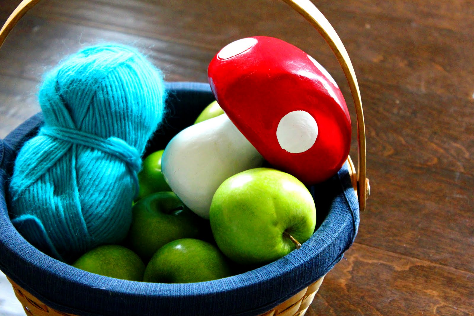
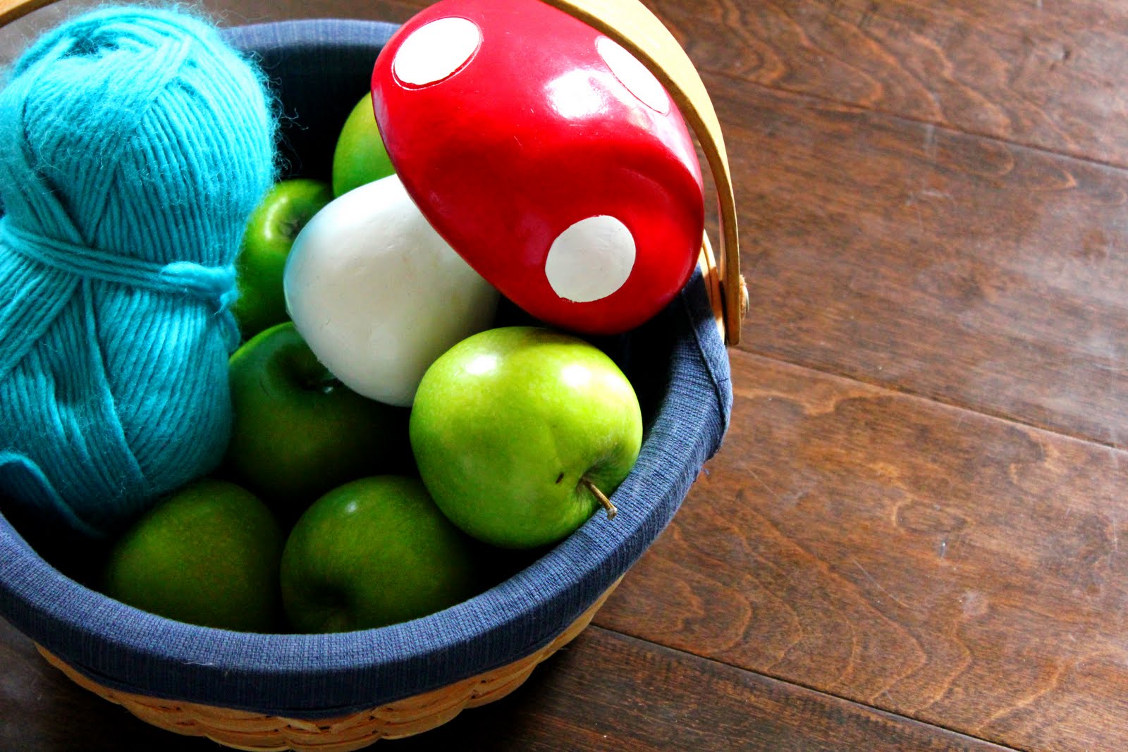
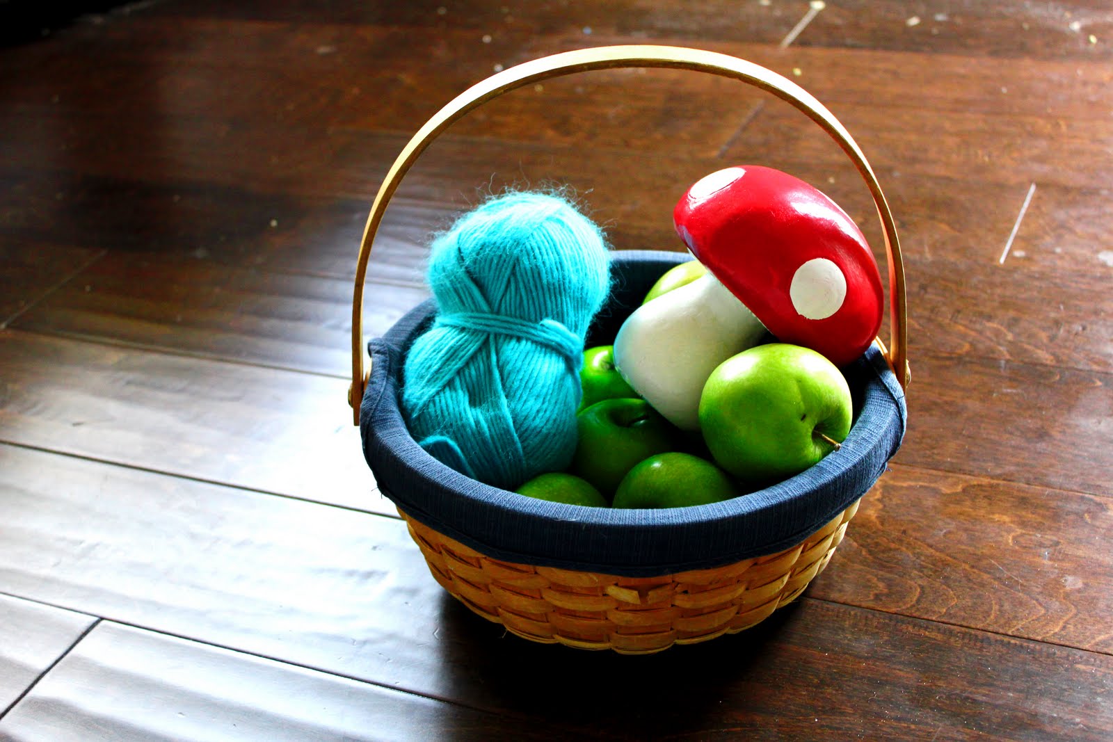
Here I go!!!! For the Banner number 5. It looks like a straight forward picture. Your stands is great and the apron itself is flat which I like for a banner shot. Also I really like the positioning of the chicken. Something about the combo seems to portray your blog. For the blog button number 7. I like the reflection on the mushroom. It makes it brighter then the other two, and I also like the positioning of the basket. I would totally click on that! Ha!
I like #1 and #6.
I like #1 and #6.
okay, I just posted it to FB and to my 2 of my cousin's fb walls! love it!
I just became a follower!I love #3 and #5. Something about the lines of #5 though has me leaning toward that one.as for the blog button, definitely #7. hands down. love the off centeredness of it and how it's not all completely in the shot, but partly out of the picture.love that apron!;) thanks so much for the chance!
Hi prima! I'm not a follower but Bianca is and today is her daughter's birtday yzabella. She has been inspired by your ideas that she made a barbie box with a refrigerator box. Plus she baked for her daughter with ice cream cones. I suggest #4 you look relax in your legs with knee bent and your arms with the hen. Your hands in #1 and #2 your veins are stick out and looks you are holding the hen for dear life. The back ground and where you are set up is good because when look at the pic it is focus on you then the eye wanders to the background to see what's backthere. Good transition to the eyes. #5 don't like you are stand to straight up and legs are side by side looks uncomfortable. Thumbnail #7 don't want to much of a close up like #6 want to have set back a little to where the eye wants to know what's in the basket. #8 would not suggest because its way to far and looks thrown there on the floor not very appealing to the eye- Bland. #6 gives it enough for someone to interested. The banner suggestion make sure the pic is high resoultion 300 and you don't want to pick a picture close up only because the banner will be stretching out the close pic and will look distorted. I like what you have going on very colorful and inviting. Good Luck Prima! Olivia
Overall, Id' go with 5 and 7. Why 5? You've captured everything you want in that photograph, without looking coy or posed. A few of the photos your legs were turned or the hem was flying up and it almost looked forced. I think 5 is very natural. I like 7 because you can see everything including the table, and it is off-centered, which really appeals to me.
I like 1 and 6…I don't know the rhyme or reason….I just like it 🙂
Hi! I also linked your giveaway to my blog at:http://thesweetnessofhome.blogspot.com/2011/05/crunchy-catholic-momma-help-me-pick.htmland on my facebook page!:)God's blessings,Stephanie@thesweetnessofhome.blogspot.com
I like #1 for the banner because of the profile position of the chicken and number 8 for the button. #8 seemed like a more centered picture for me which is what I would like for a button. I already follow you-found you via Cathswap Frugal Fridays:)
I already follow you. Great blog! I like #5 and #7. I like 5 because of your hands, although I can't say why they're better there than the others. And I like 7 because I think it is a good mix of table and basket.
Debbie, Wow, sounds like you know a lot about photography of which I know zilch haha. I am going to see if I can take the glow off that yarn lol.
Grammy Suzzy, thank you I am really stuck so I hope this helps to pick one.
For the banner, I like #3 because of the position of the hen and the straight lines of your legs, apron, arm, etc. The ones with your knees bent or feet not aligned just look a bit sloppy. I also like where your body is positioned in the shot with a lot of negative space to the left. What is difficult to tell is how the picture will be cropped to create a banner…As far as the button, I envisioned something square, so again it's kind of hard to tell, but I like #7 because there is not the glare above the blue yarn which also makes the top of the blue yarn look blown out as well. I think the lighting is actually too harsh in all three. (sorry)
I am already a follower…just love the stuff I read, though I don't know how I missed you for so long. I have no explanation why, but I like banner #2 and button #6.I think the sweet hen just looks happier to me in #2 and I like the more natural lighting in #6…I am no expert, but that's what I like.